©2026
2025
Figma
20 days
Personal Project
YEAR
TOOLKIT
TIMEFRAME
TYPE
©2026

2025
YEAR
Figma
Personal Project
TYPE
TOOLKIT
20 days
20 days
TIMEFRAME
TIMEFRAME
DOGBITES
DOGBITES


PROBLEM
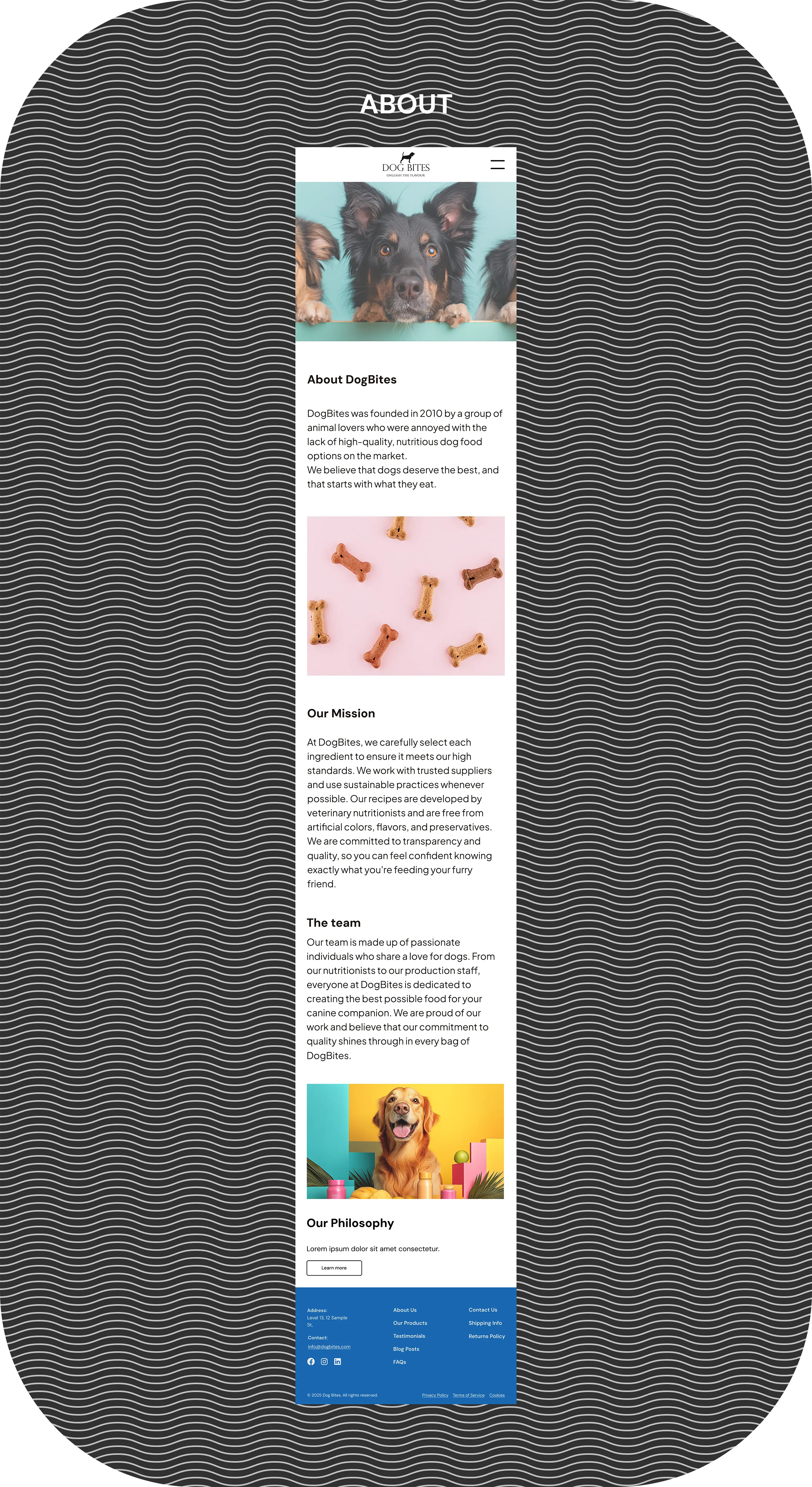
DogBites was passionately founded by a dedicated group of animal lovers who were united by a shared commitment to canine health and happiness.
The philosophy is the deeply held conviction that all dogs are cherished family members who deserve the best possible nutrition available, and we know that this fundamental standard of health,
energy, and well-being starts directly with the high-quality ingredients in what they eat.
DogBites was passionately founded by a dedicated group of animal lovers who were united by a shared commitment to canine health and happiness.
The philosophy is the deeply held conviction that all dogs are cherished family members who deserve the best possible nutrition available, and we know that this fundamental standard of health, energy, and well-being starts directly with the high-quality ingredients in what they eat.
DOGBITES
2025
Figma
20 days
Personal Project
YEAR
TOOLKIT
TIMEFRAME
TYPE
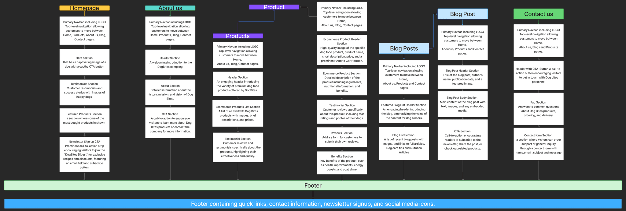
The user flow diagram is a visual aid that clearly points out the intended logic of user interaction, demonstrating
exactly how the sequence of navigating the various pages has been meticulously planned to add up to a clear,
intuitive, and unobstructed path for every user.
The user flow diagram is a visual aid that clearly points out the intended logic of user interaction, demonstrating exactly how the sequence of navigating the various pages has been meticulously planned to add up to a clear, intuitive, and unobstructed path for every user.
The user flow diagram is a visual aid that clearly points out the intended logic of user interaction, demonstrating exactly how the sequence of navigating the various pages has been meticulously planned to add up to a clear, intuitive, and unobstructed path for every user.
Recognizing that many commercially available products fell short of necessary standards, the lack of high-quality,
nutritious dog food on the market became a critical problem that had to be addressed immediately to ensure that
pet owners could easily provide their beloved companions with the diet food they deserved.
Recognizing that many commercially available products fell short of necessary standards, the lack of high-quality, nutritious dog food on the market became a critical problem that had to be addressed immediately to ensure that pet owners could easily provide their beloved companions with the diet food they deserved.
Recognizing that many commercially available products fell short of necessary standards, the lack of high-quality, nutritious dog food on the market became a critical problem that had to be addressed immediately to ensure that pet owners could easily provide their beloved companions with the diet food they deserved.
SOLUTION
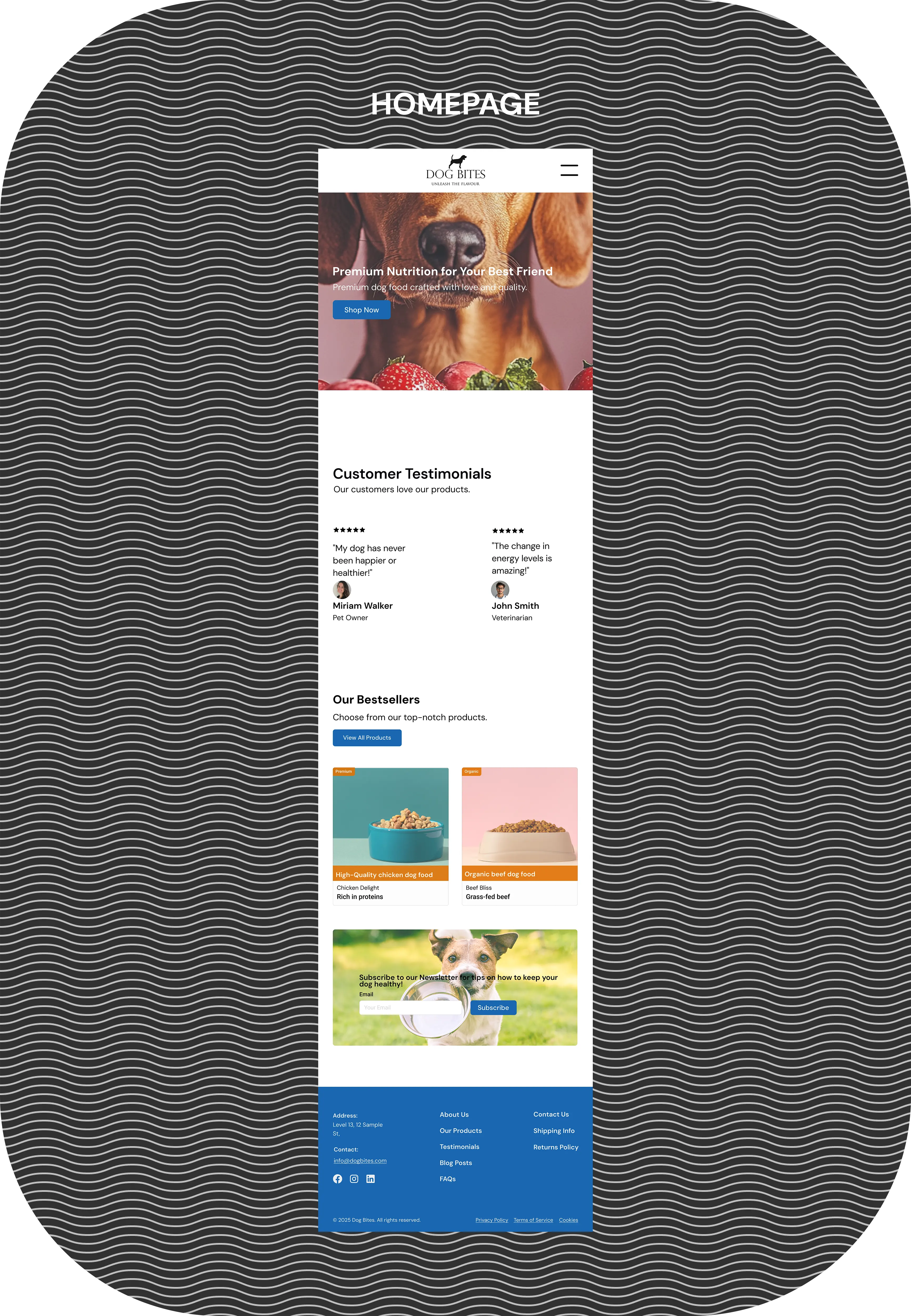
The core objective was to successfully develop a strong visual language that was both appealing and recognizable,
effectively positioning DogBites to stand out as the premier online destination by providing users with a comprehensive
space where they could easily purchase premium, nutritious dog food while simultaneously enriching their knowledge
and understanding of their pets needs and behaviors through a library of specialized blog articles.
The core objective was to successfully develop a strong visual language that was both appealing and recognizable, effectively positioning DogBites to stand out as the premier online destination by providing users with a comprehensive space where they could easily purchase premium, nutritious dog food while simultaneously enriching their knowledge
and understanding of their pets needs and behaviors through a library of specialized blog articles.
The core objective was to successfully develop a strong visual language that was both appealing and recognizable, effectively positioning DogBites to stand out as the premier online destination by providing users with a comprehensive space where they could easily purchase premium, nutritious dog food while simultaneously enriching their knowledge and understanding of their pets needs and behaviors through a library of specialized blog articles.
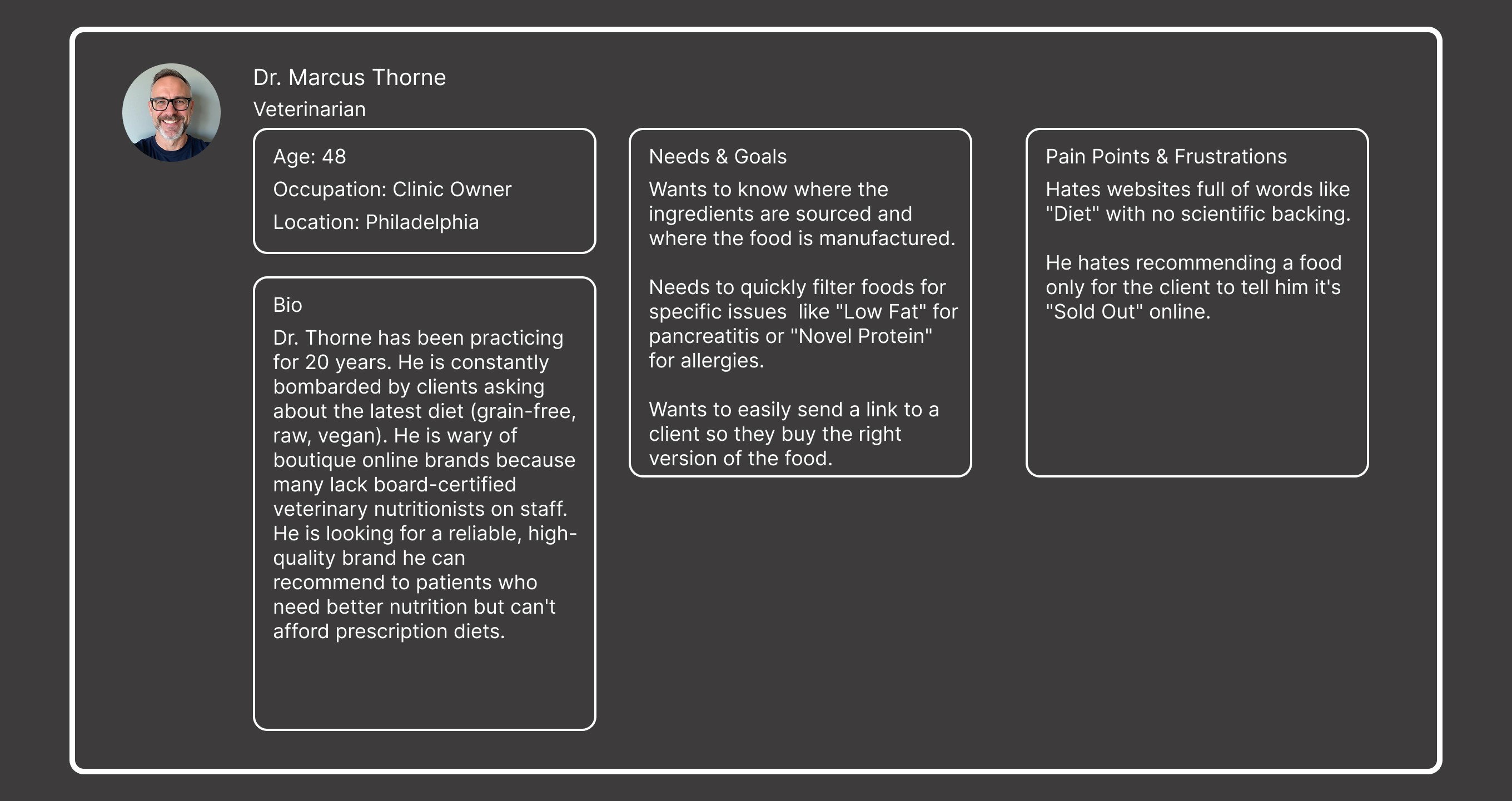
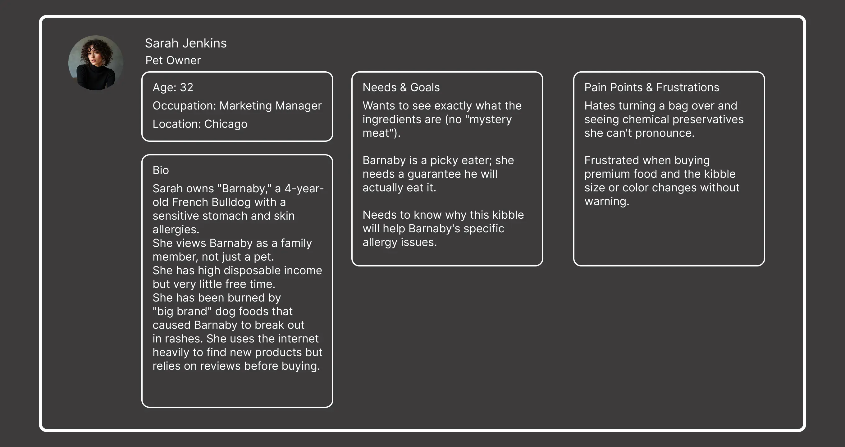
The study on users through personas defined who the product is for, preventing the idea of designing for a vague
"everyone," and helps prioritize features that solve real user problems. The whole process makes it easier to discuss
users and their needs, reducing subjective assumptions and building a stronger, user-centric product.
It centers the focus on the user's perspective into every stage, ensuring the final product is intuitive, effective
and successful.
The study on users through personas defined who the product is for, preventing the idea of designing for a vague "everyone," and helps prioritize features that solve real user problems. The whole process makes it easier to discuss users and their needs, reducing subjective assumptions and building a stronger, user-centric product.
It centers the focus on the user's perspective into every stage, ensuring the final product is intuitive, effective and successful.
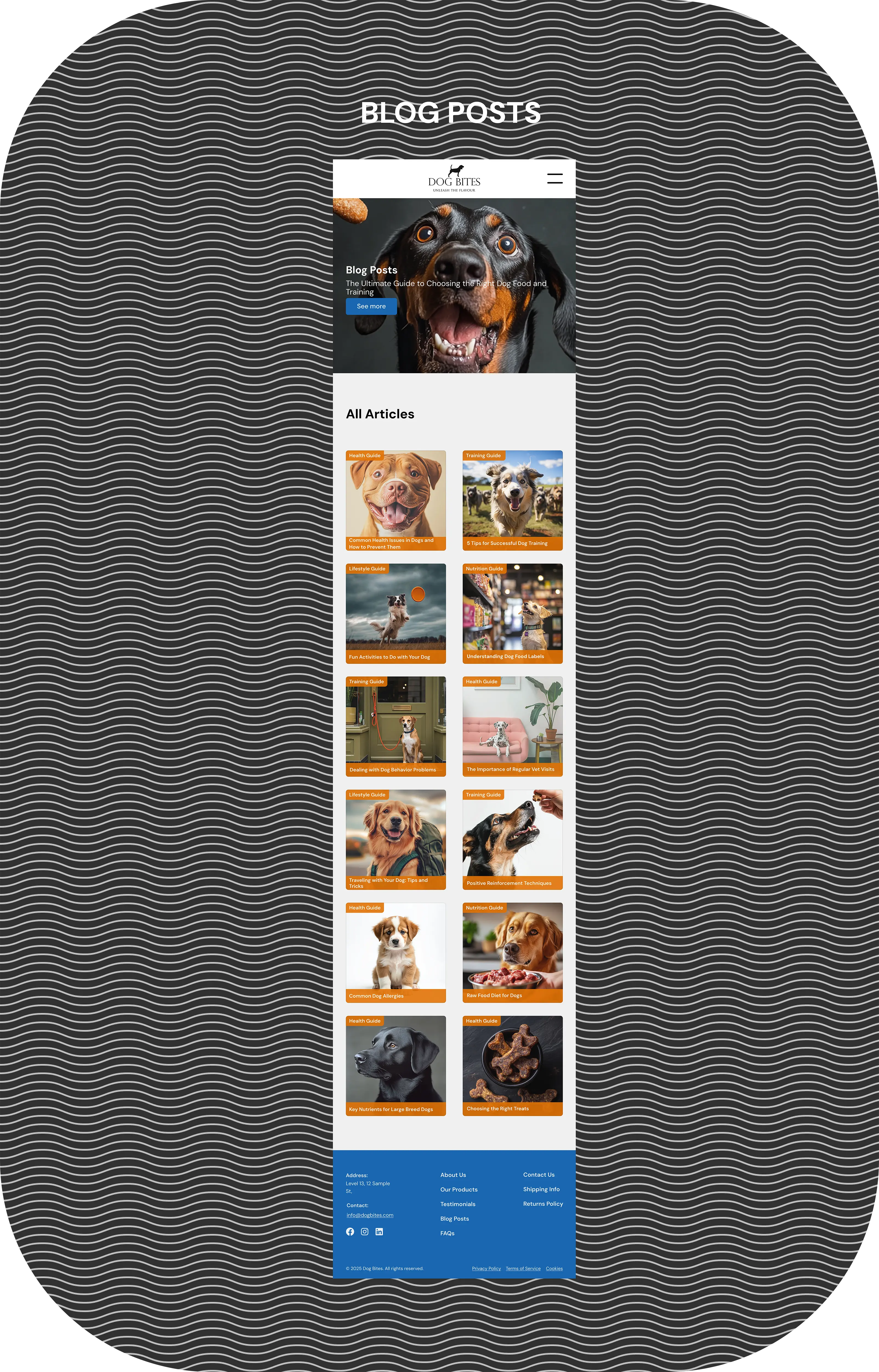
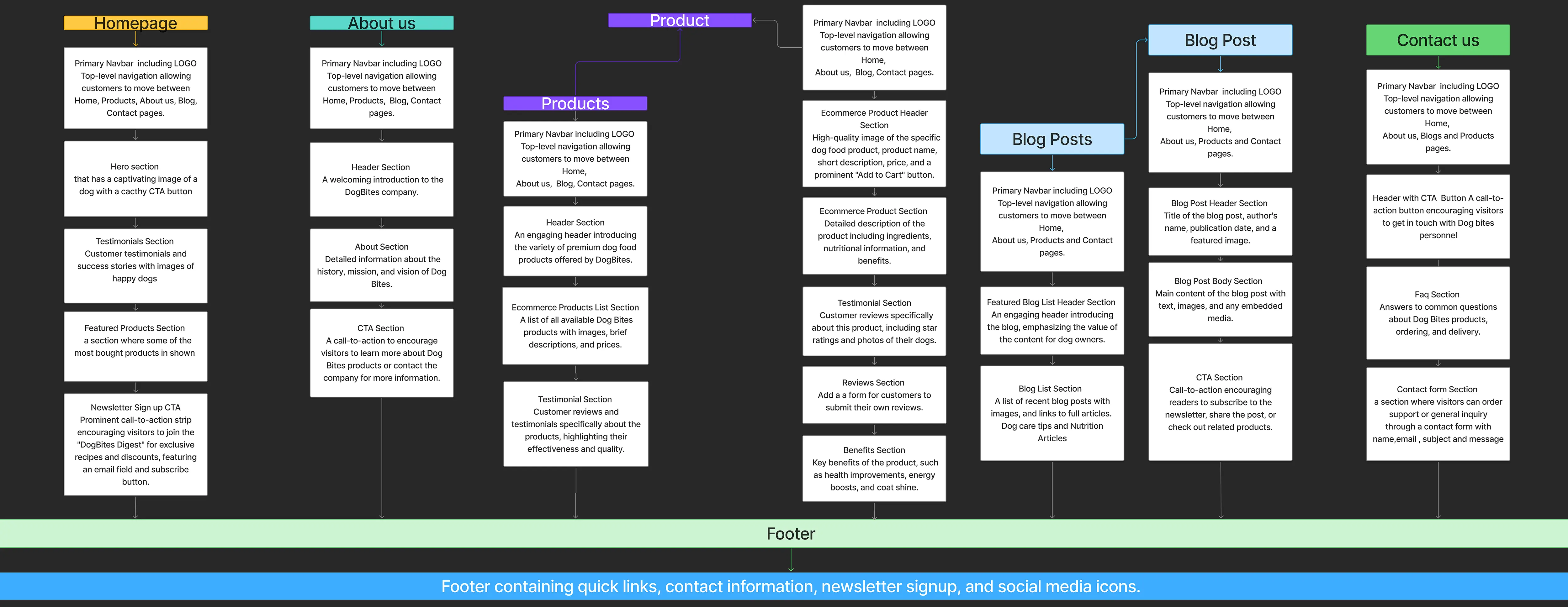
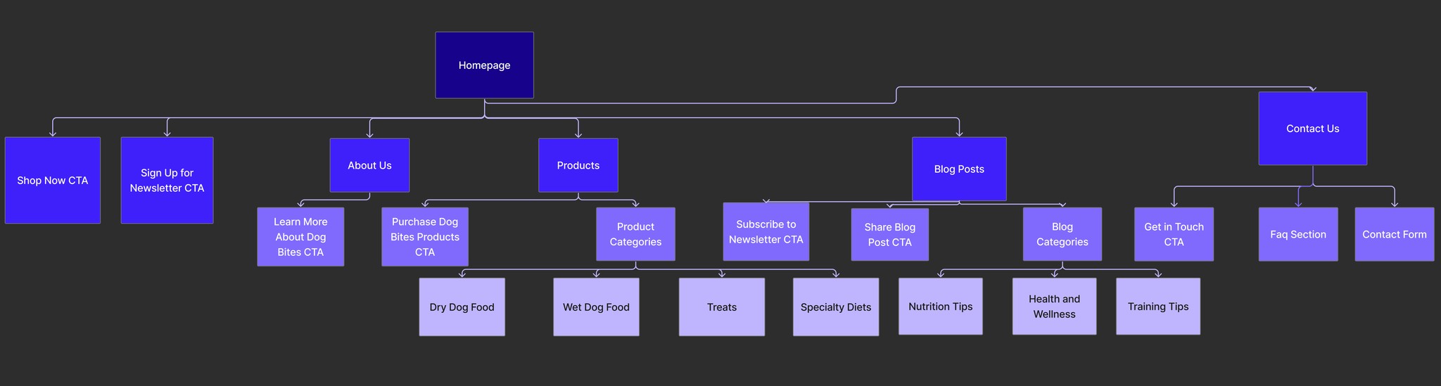
The site map did organizes content hierarchically, showing the relationships between pages.It also helped design
intuitive paths for users to find information easily, reducing frustration.
The site map did organizes content hierarchically, showing the relationships between pages. It also helped design intuitive paths for users to find information easily, reducing frustration.
The site map did organizes content hierarchically, showing the relationships between pages.
It also helped design intuitive paths for users to find information easily, reducing frustration.
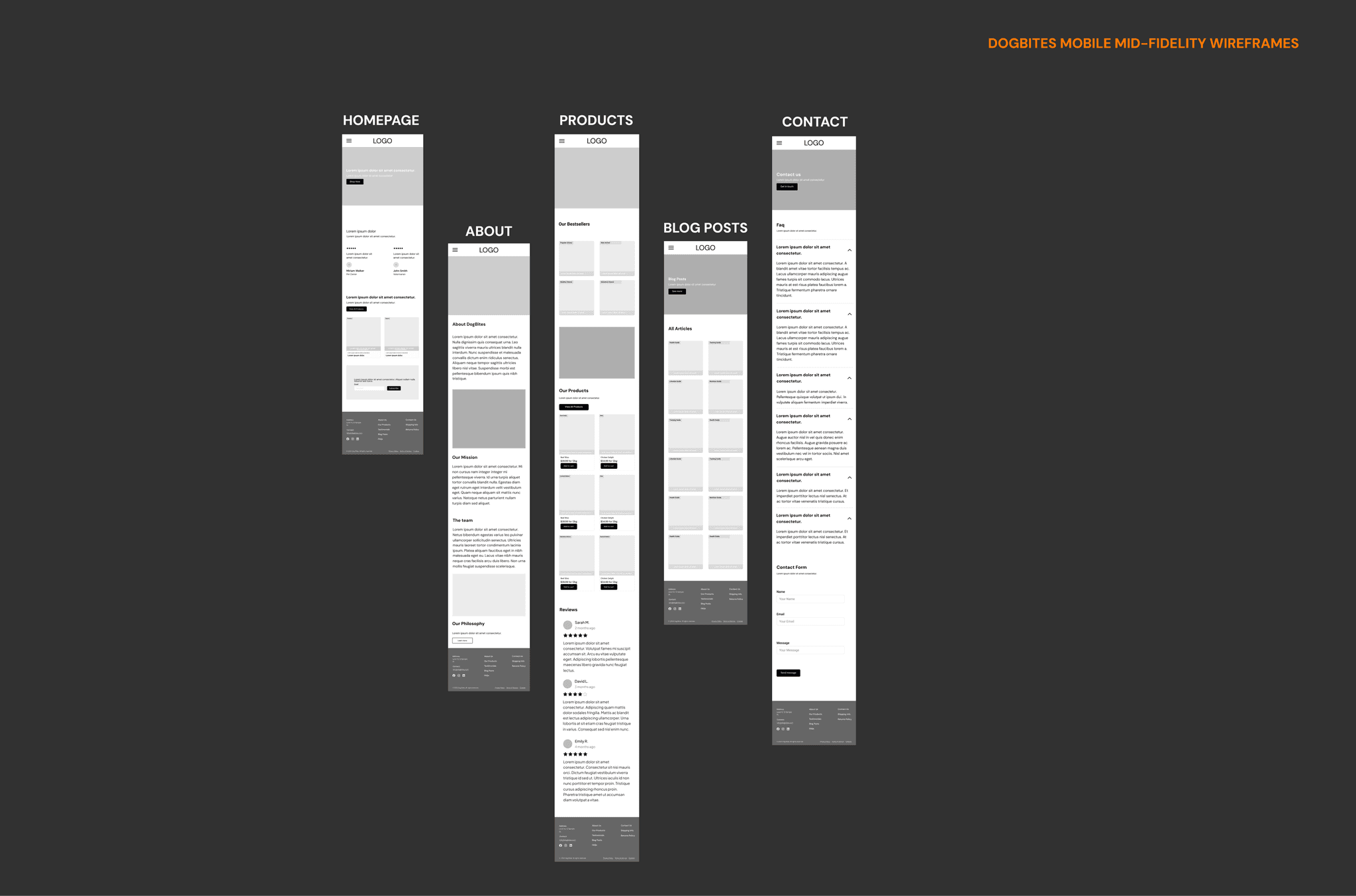
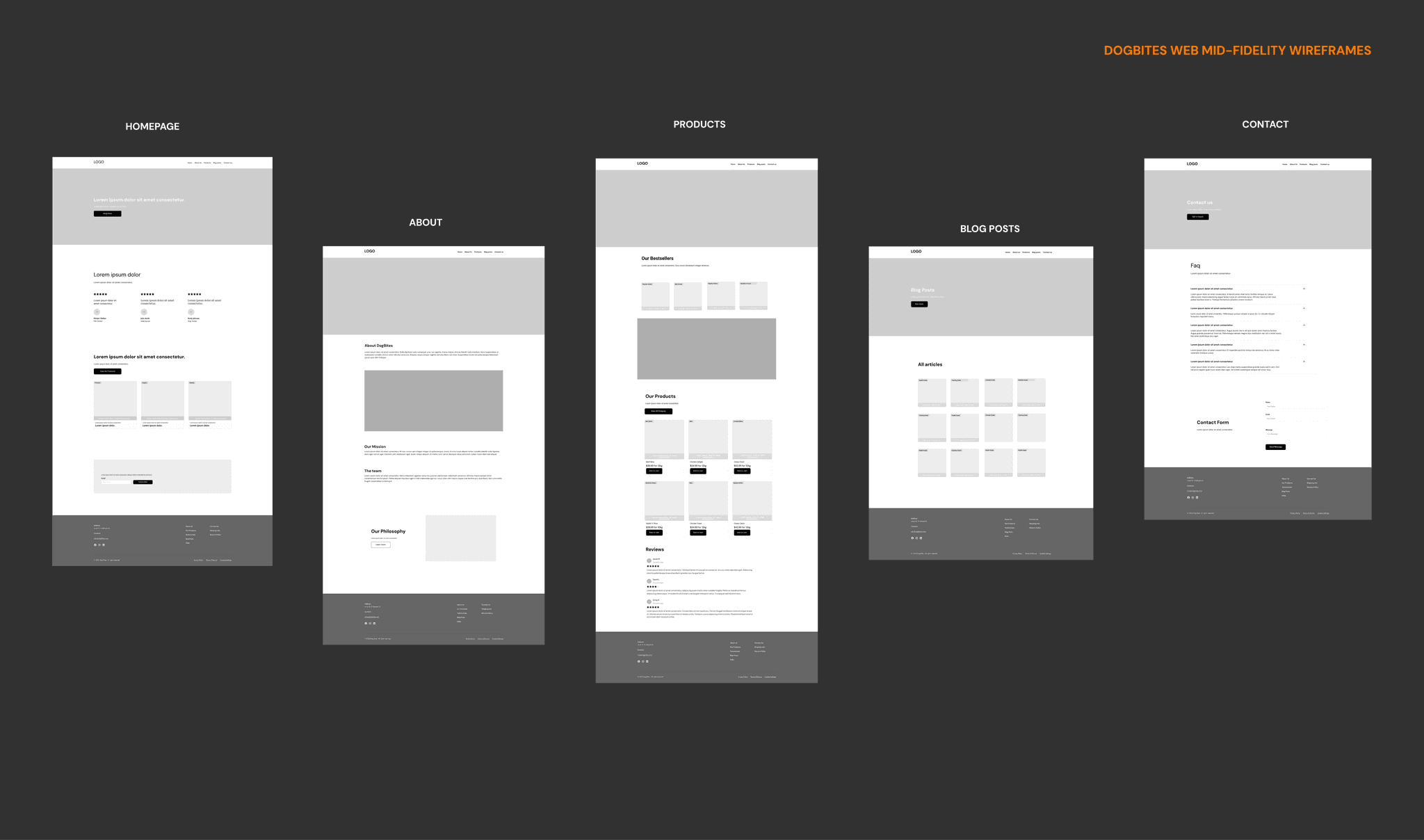
The mid-fidelity wireframes for both mobile and web offer more structure than sketches but remain easy to change,
encouraging creative problem-solving. They provided clarity, focussing discussions on structure, and enable early
usability testing, ensuring a user-centric, logical design before high-fidelity polishing begins.
The mid-fidelity wireframes for both mobile and web offer more structure than sketches but remain easy to change, encouraging creative problem-solving.
They provided clarity, focussing discussions on structure, and enable early usability testing, ensuring a user-centric, logical design before high-fidelity polishing begins.
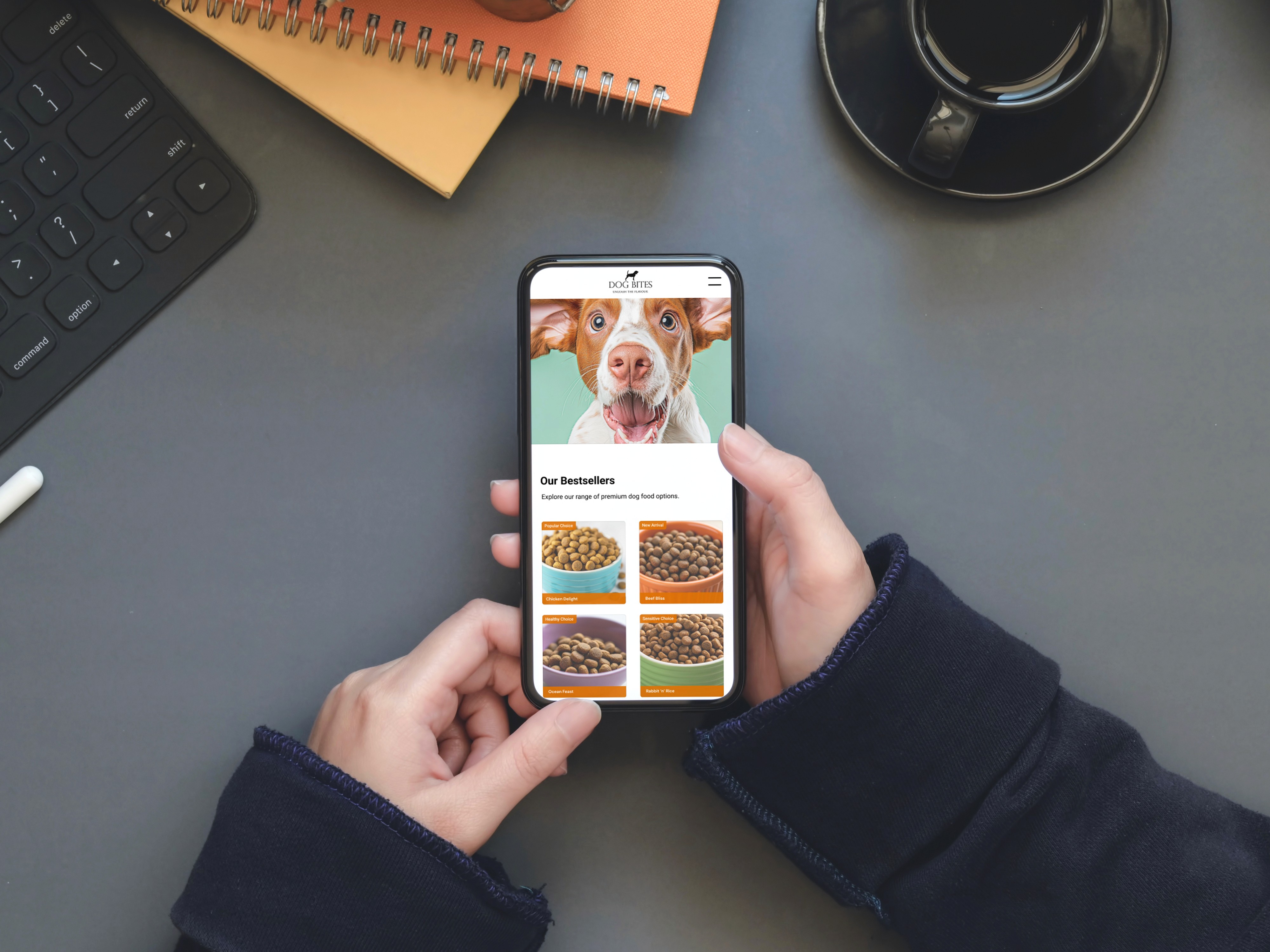
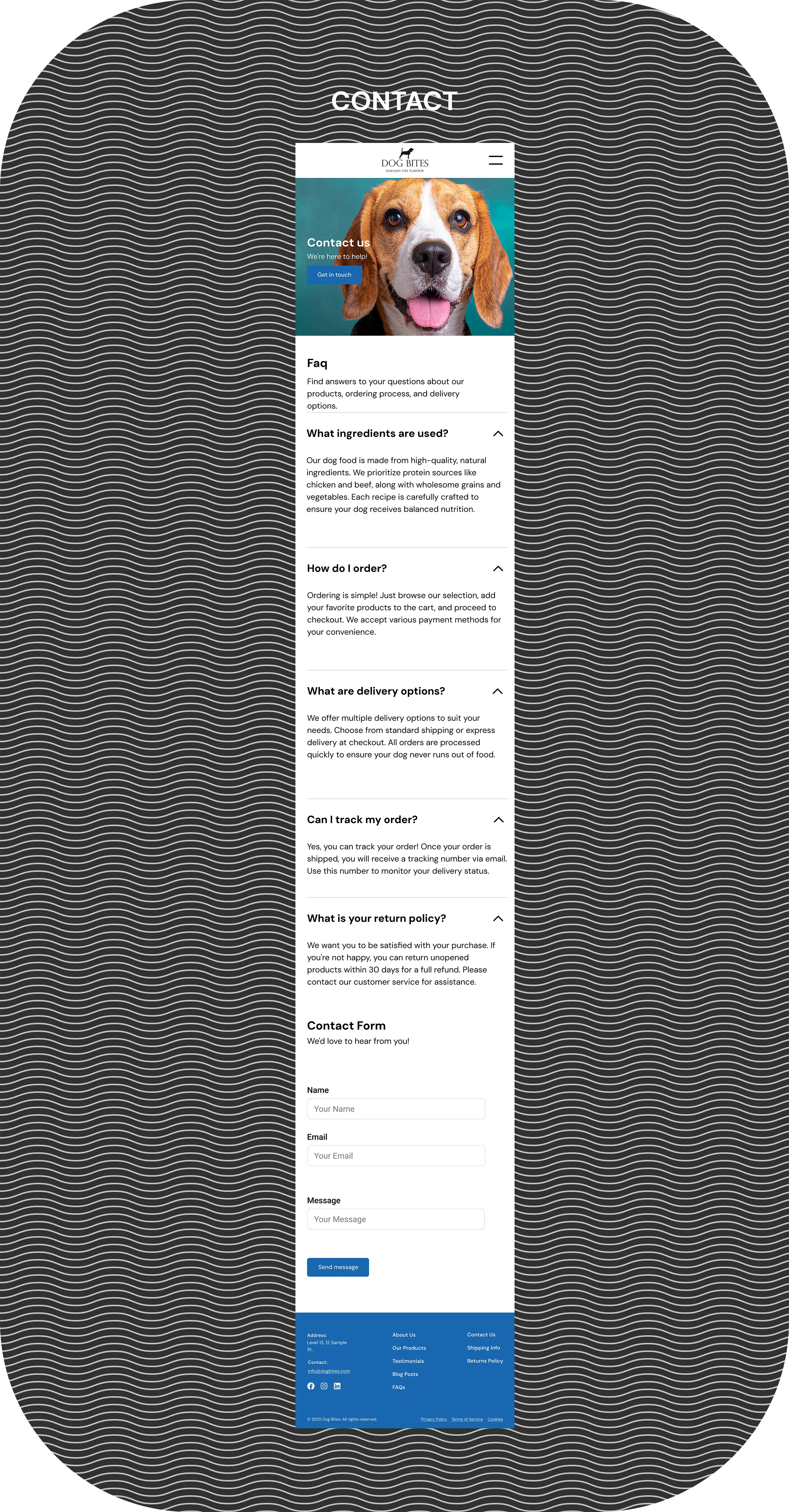
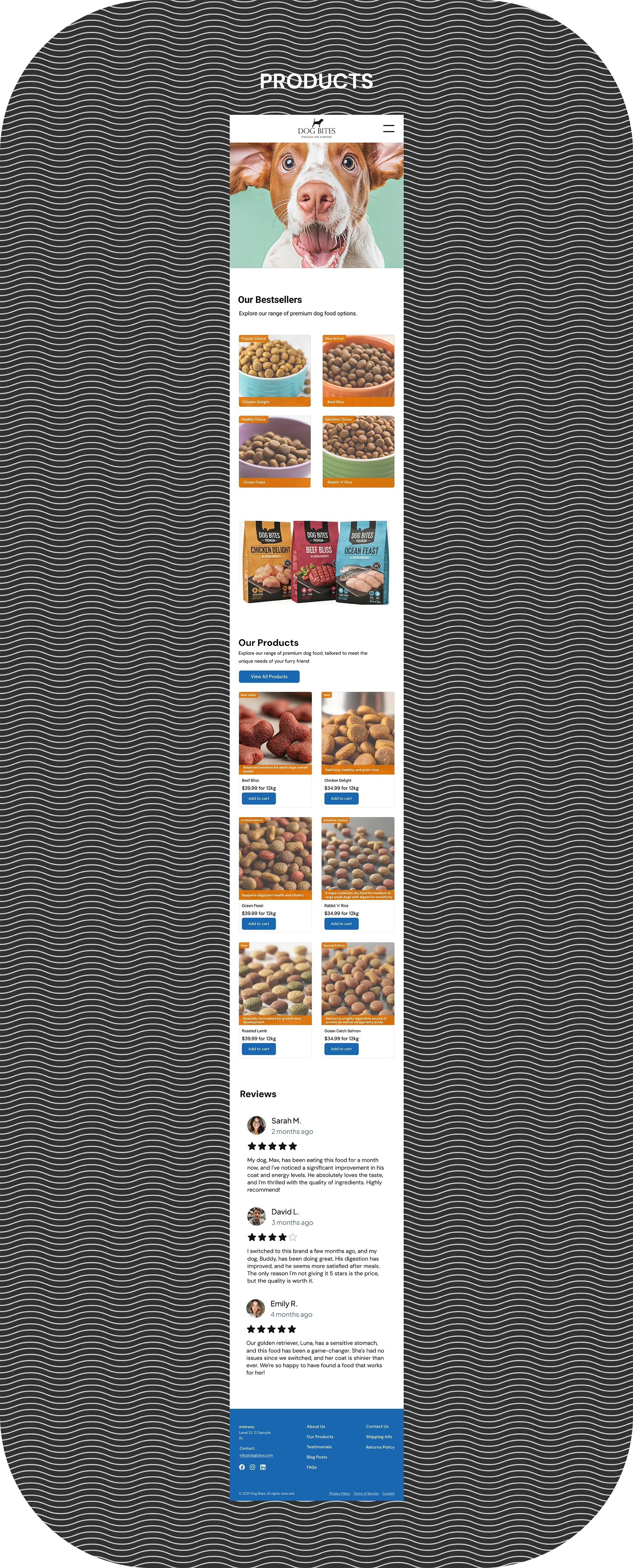
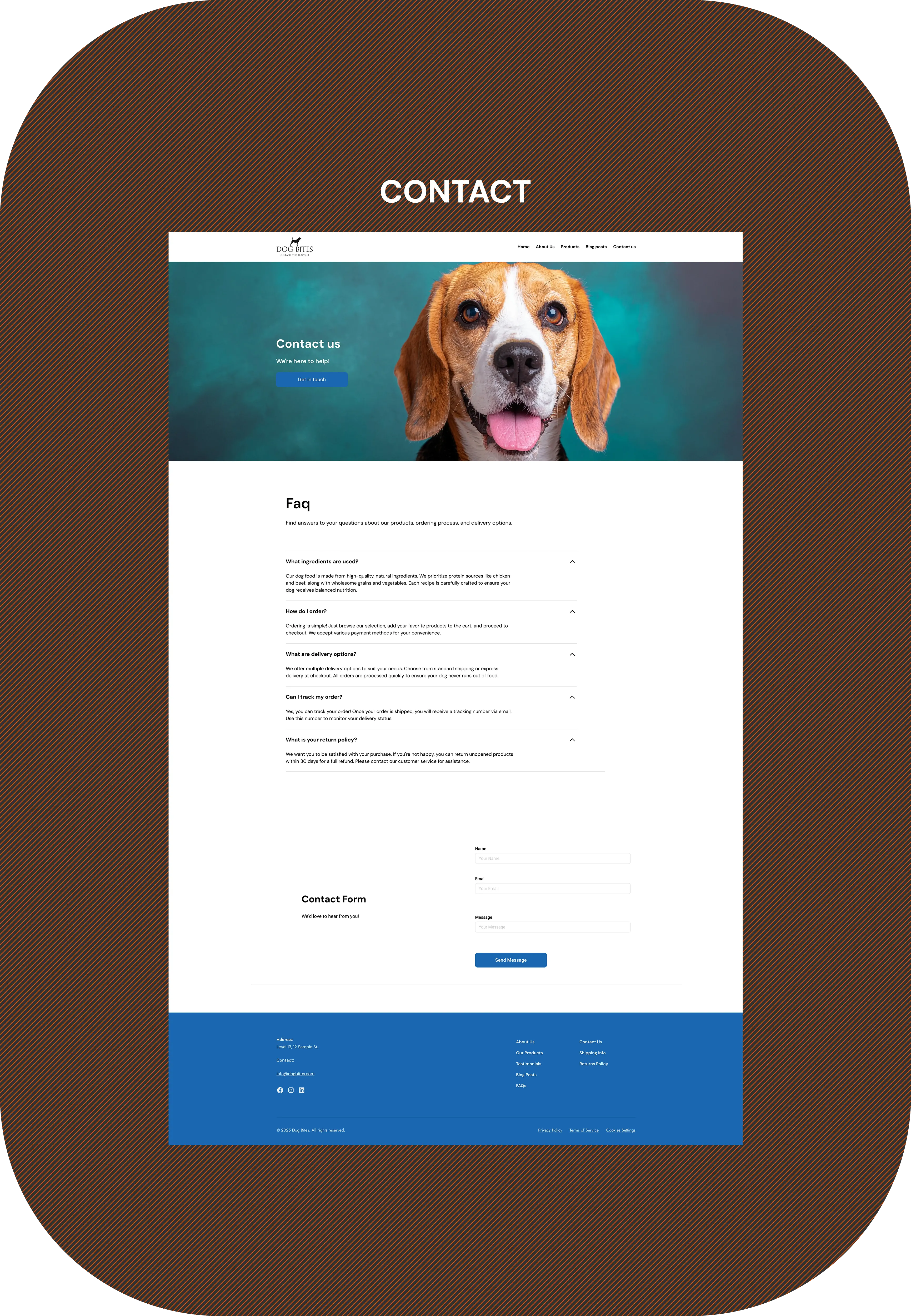
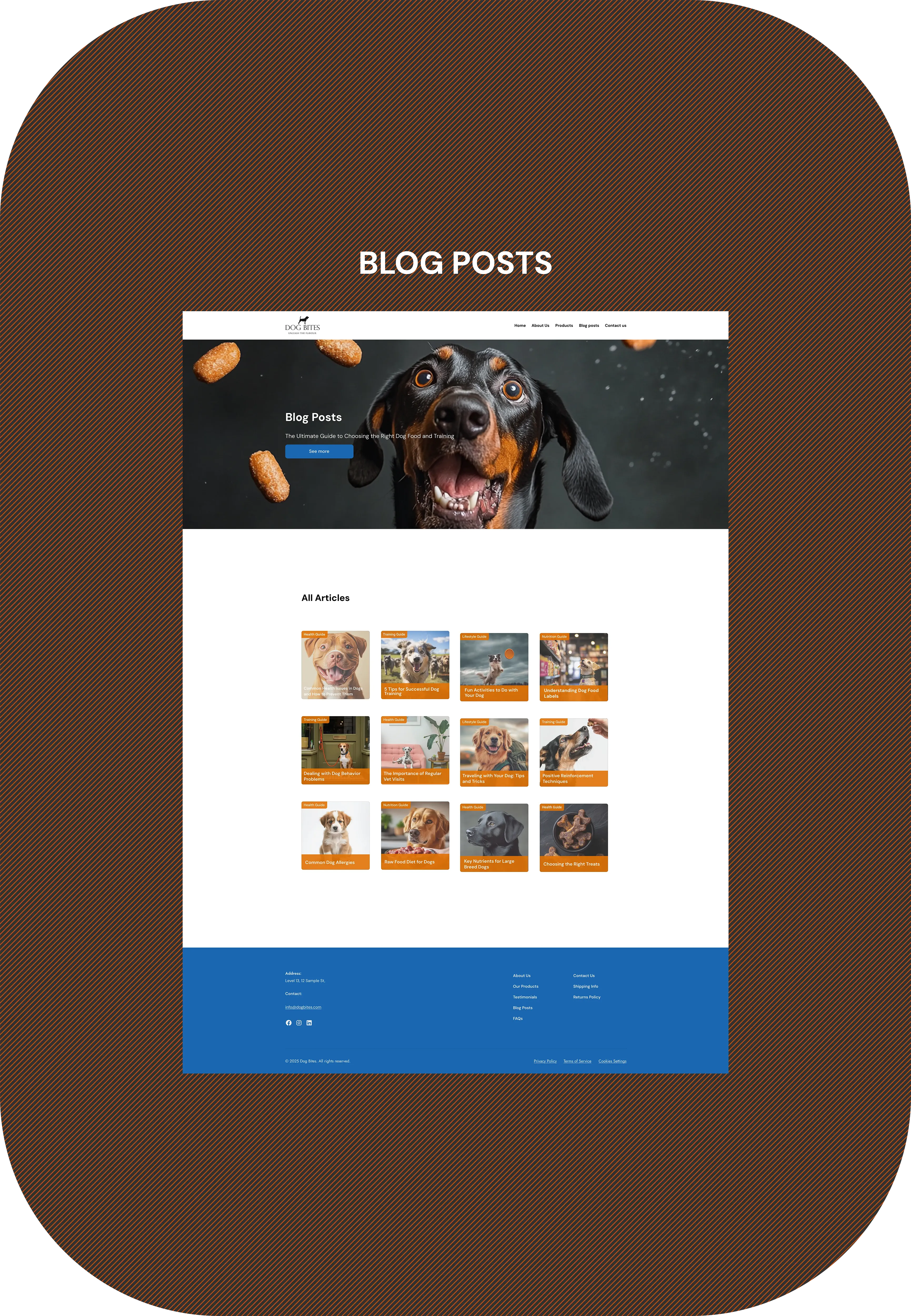
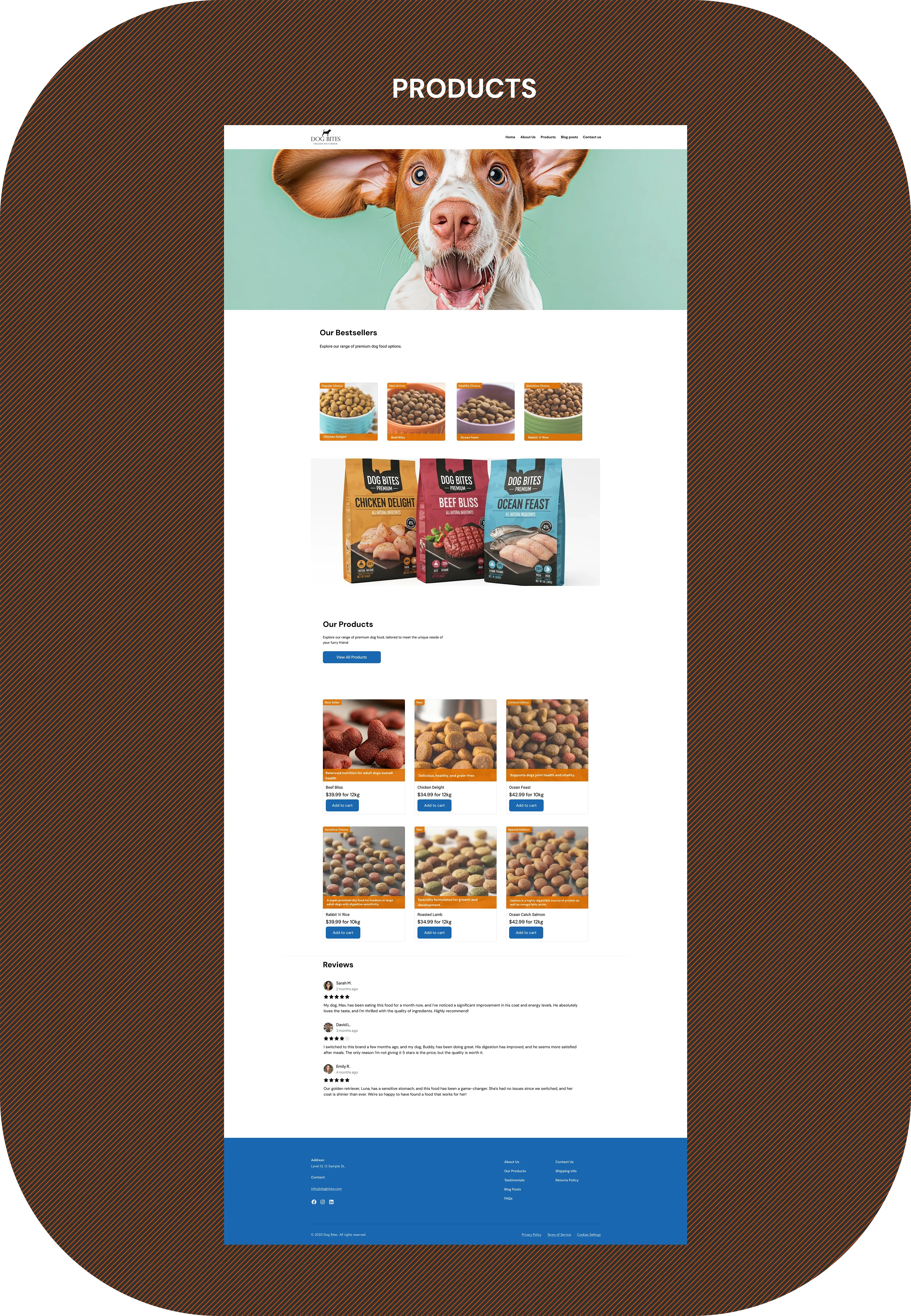
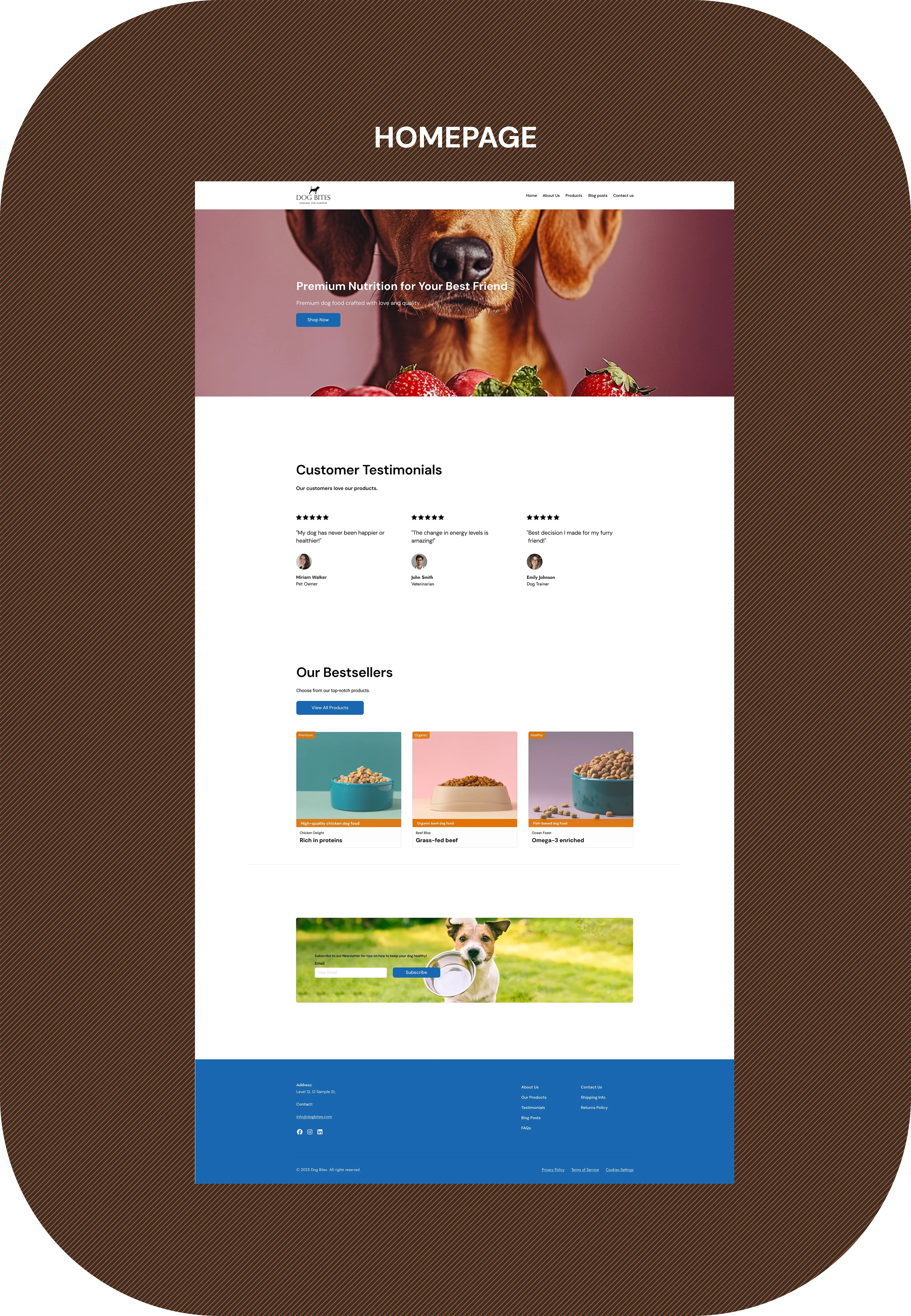
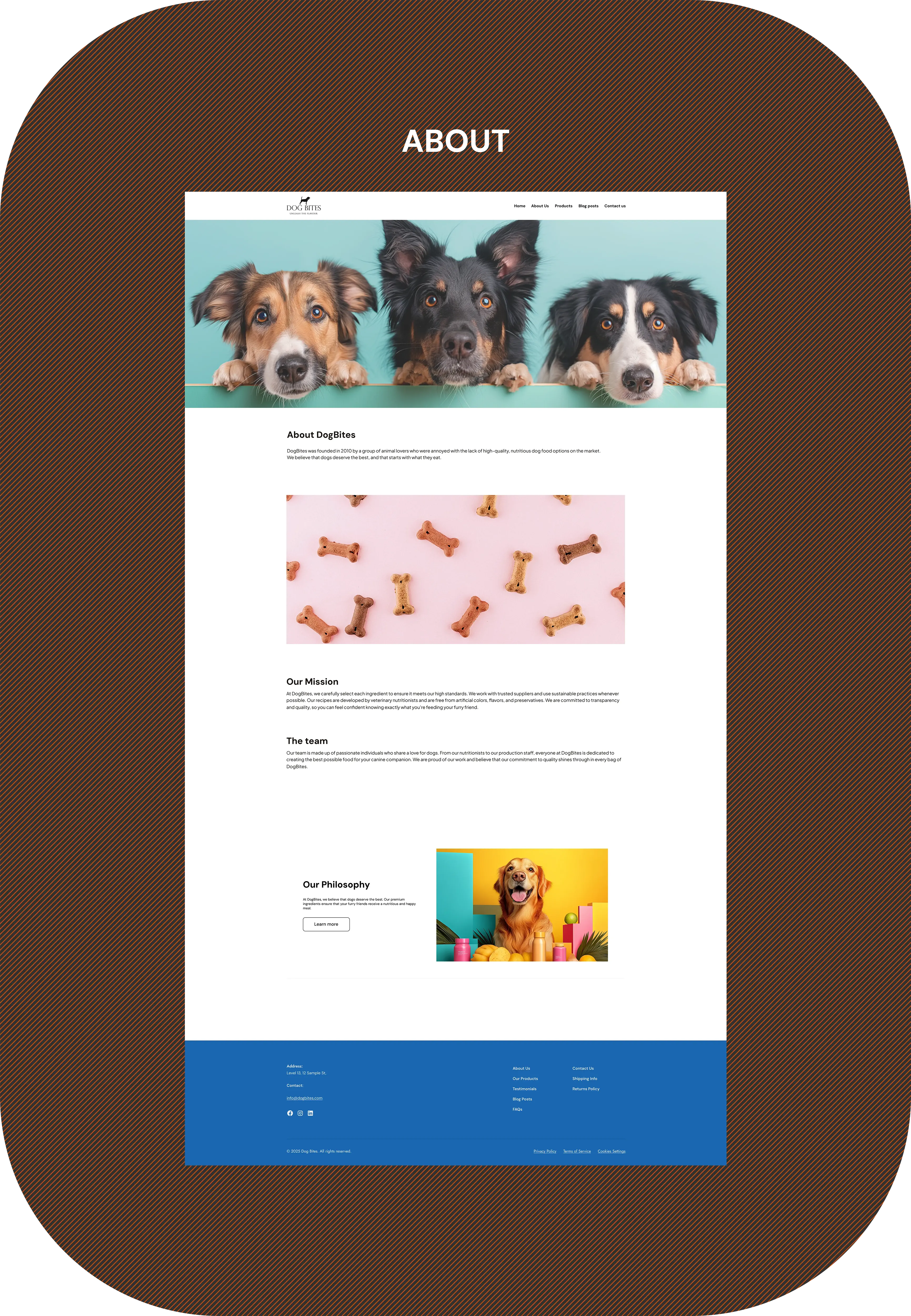
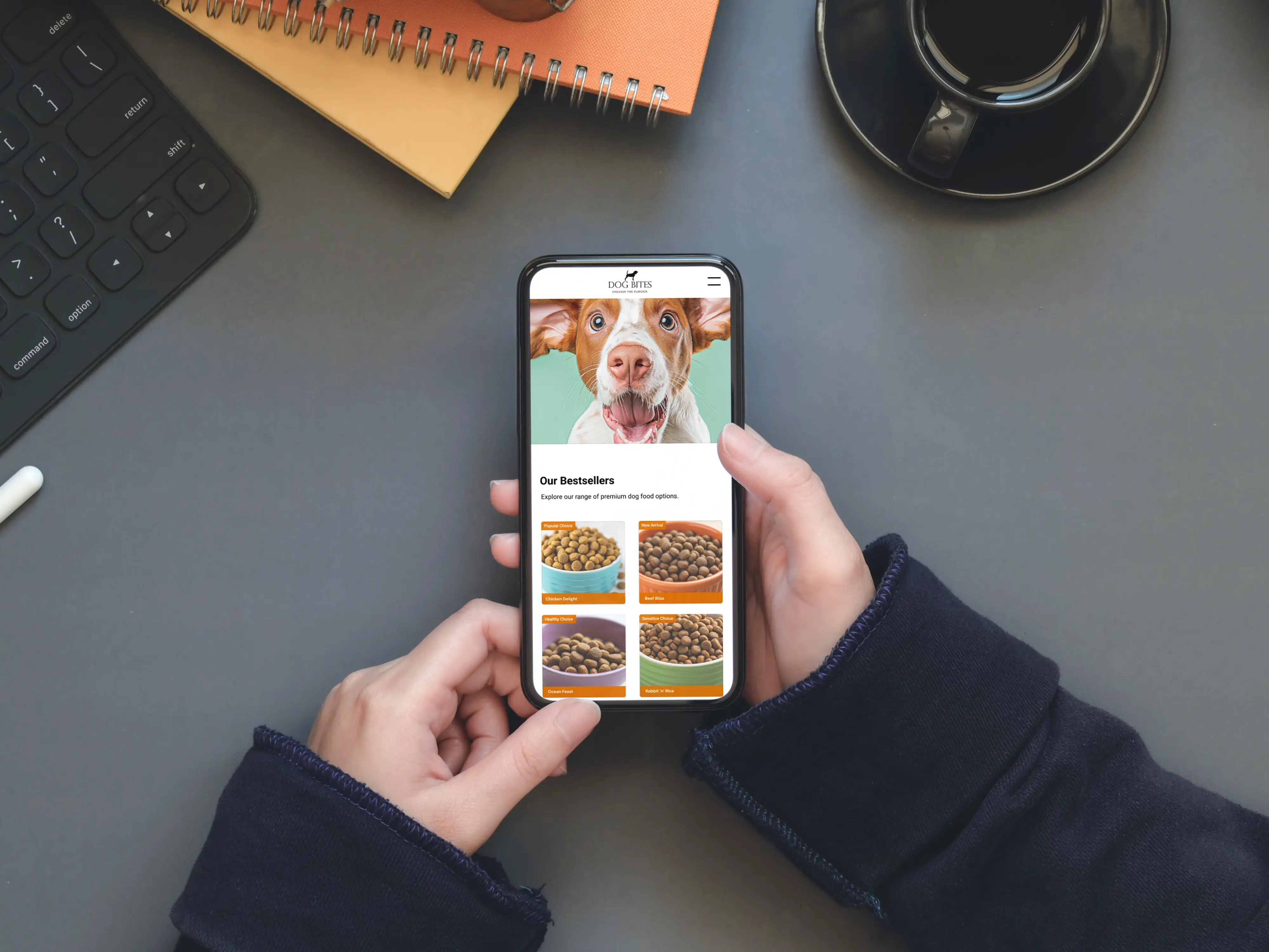
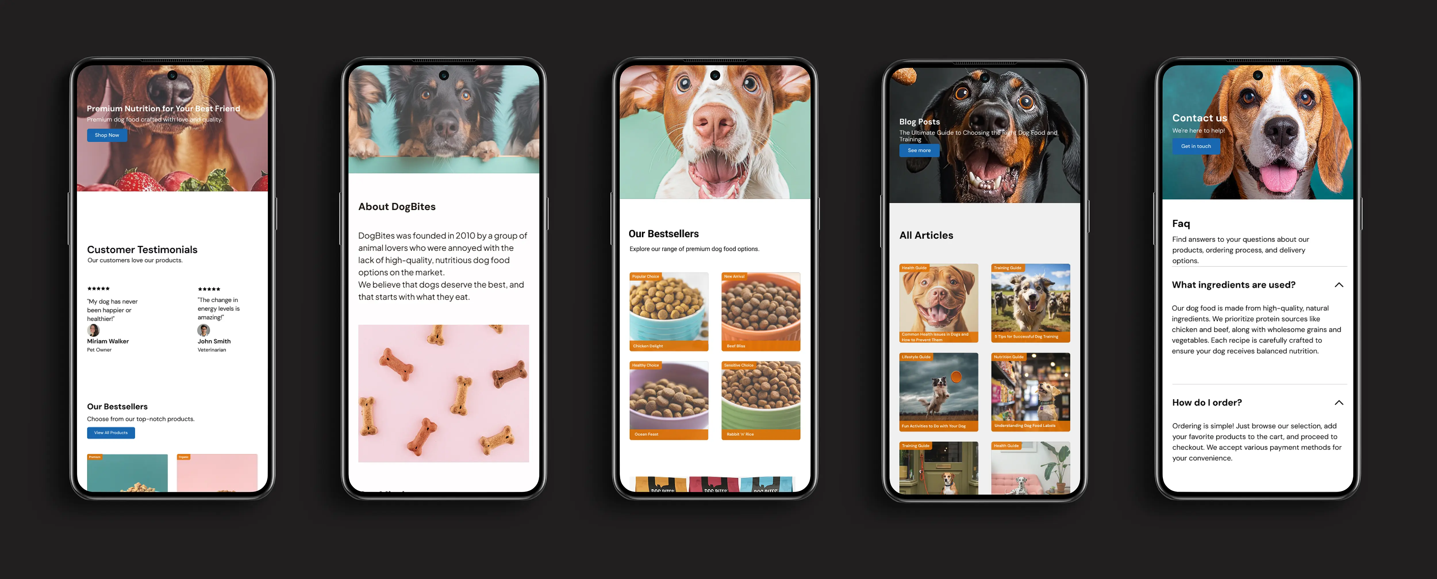
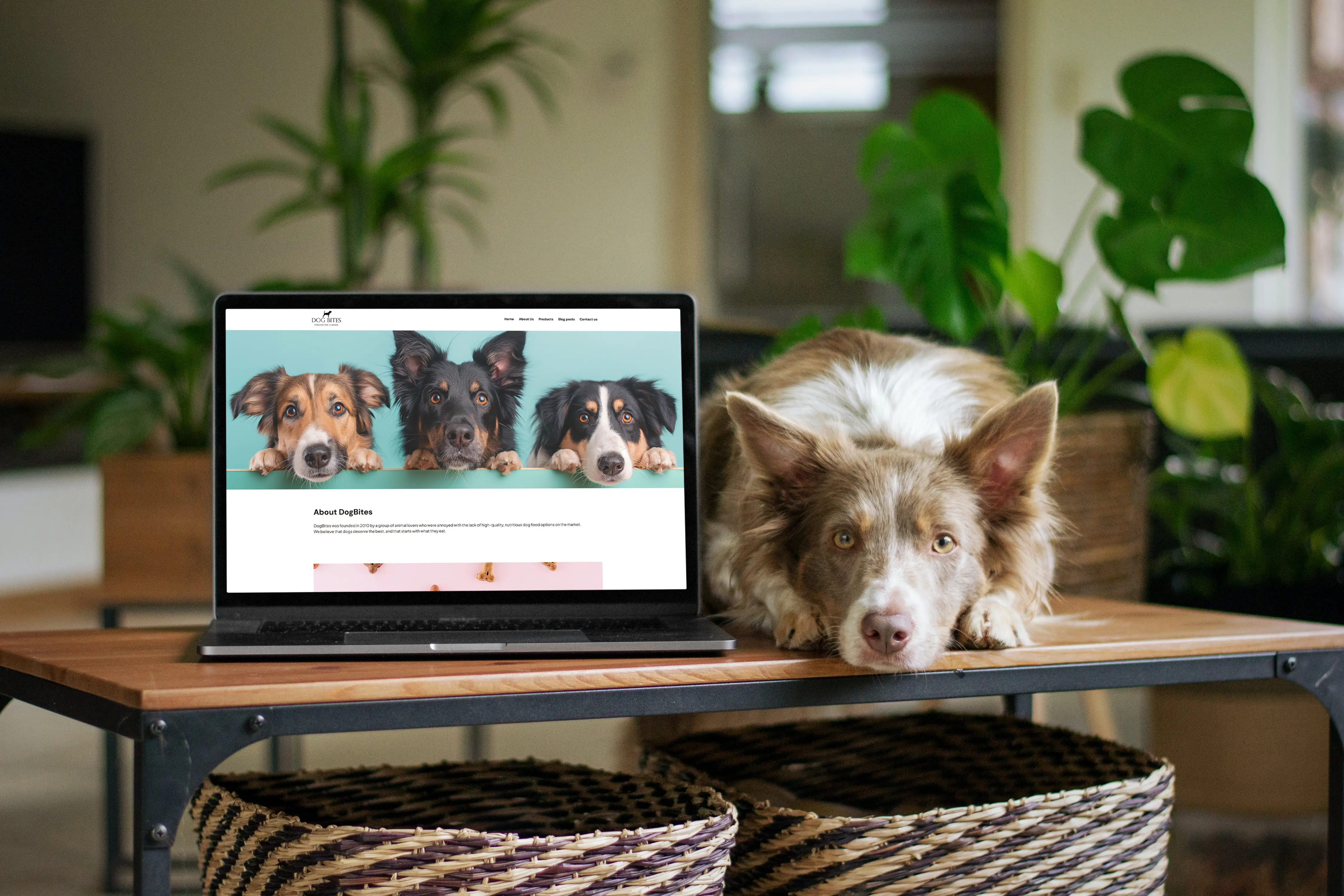
Far beyond simple wireframes, the meticulously crafted
high-fidelity mockups served as a dynamic blueprint,
transforming abstract concepts into realistic, detailed
representations by incorporating actual branding,
real content, and a defined color palette, thereby
simulating the product's final look and feel to create
a profoundly engaging and convincing design
experience.
Far beyond simple wireframes, the meticulously crafted high-fidelity mockups served as a dynamic blueprint, transforming abstract concepts into realistic, detailed representations by incorporating actual branding, real content, and a defined color palette, thereby simulating the product's final look and feel to create a profoundly engaging and convincing design experience.
Far beyond simple wireframes, the meticulously crafted high-fidelity mockups served as a dynamic blueprint, transforming abstract concepts into realistic, detailed representations by incorporating actual branding, real content, and a defined color palette, thereby simulating the product's final look and feel to create a profoundly engaging and convincing design experience.
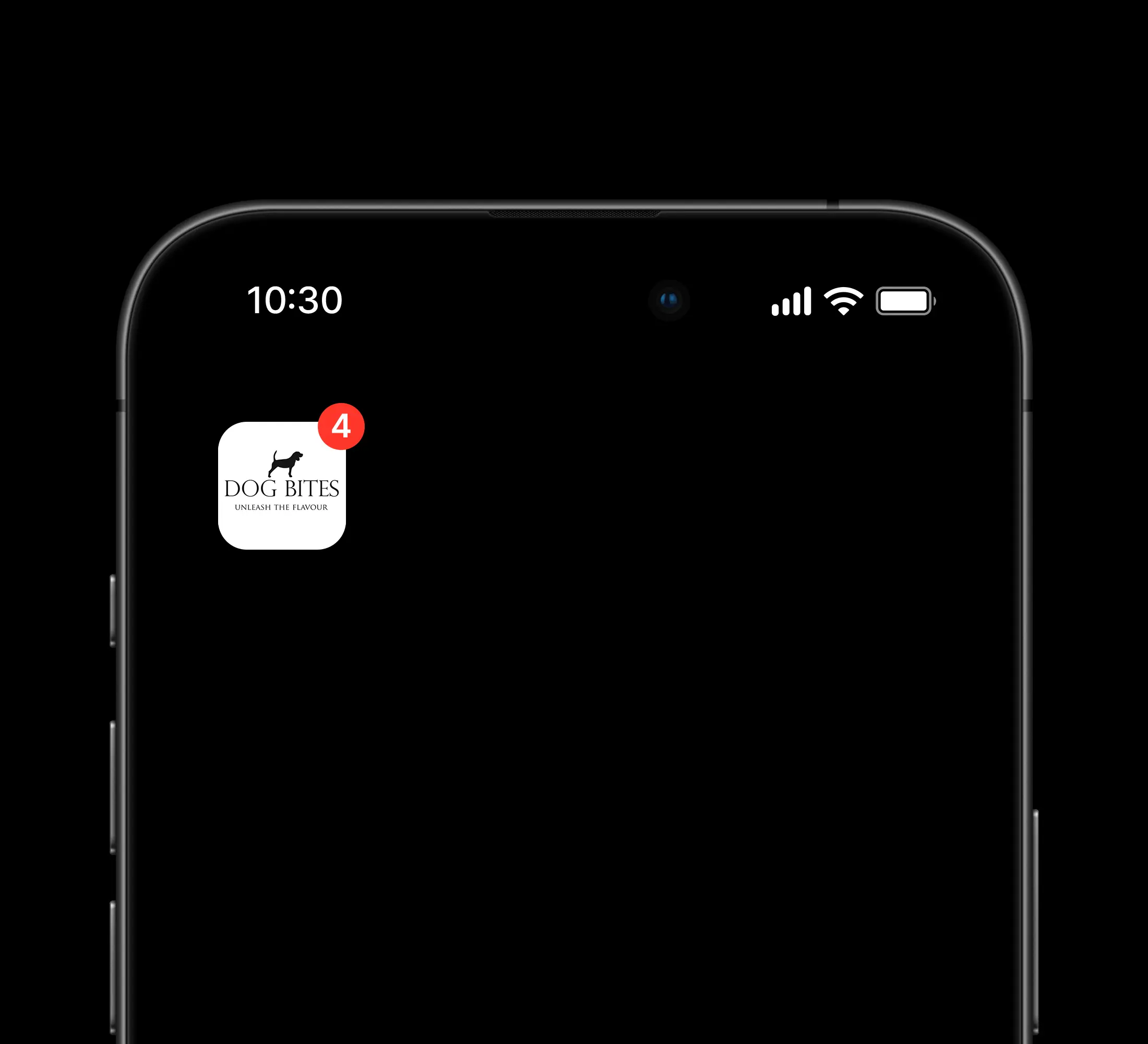
The DogBites icon was created to the purpose of being a visual element users see, helping establish brand identity and creating a memorable connection.
The DogBites icon was created to the purpose of being a visual element users see, helping establish brand identity and creating a memorable connection.
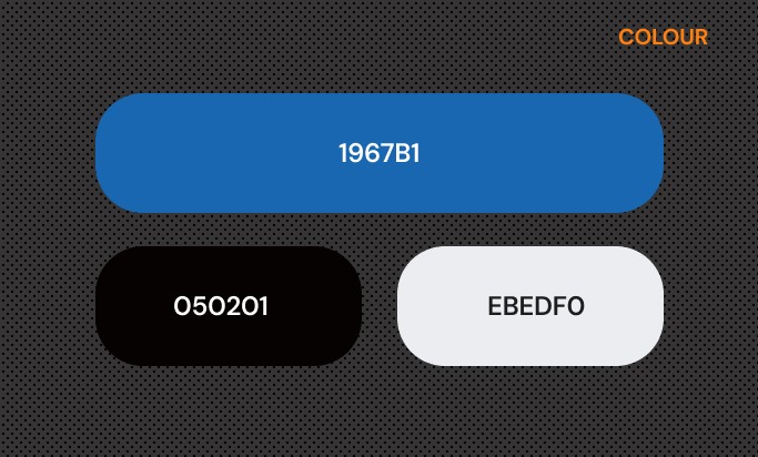
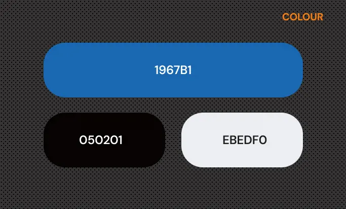
The color that was chosen for DogBites is Blue 1967B1, making users feel secure about the product or service by
evoking feelings of stability, competence, and relaxation.
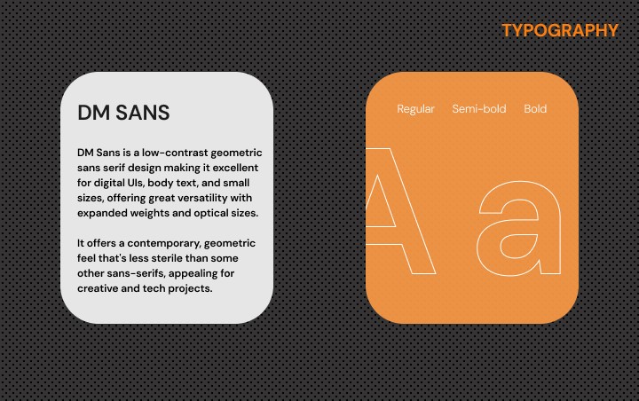
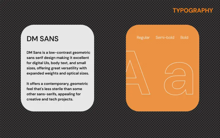
The typography used is DM SANS a font recognized for it's contemporary feel and for being appealing in creative
projects.
The color that was chosen for DogBites is Blue 1967B1, making users feel secure about the product or service by evoking feelings of stability, competence, and relaxation.
The typography used is DM SANS a font recognized for it's contemporary feel and for being appealing in creative projects.
The color that was chosen for DogBites is Blue 1967B1, making users feel secure about the product or service by evoking feelings of stability, competence, and relaxation.
The typography used is DM SANS a font recognized for it's contemporary feel and for being appealing in creative projects.
©2026
PROBLEM
SOLUTION
PROBLEM
SOLUTION